04. PySATL CPD API: Analysis
Section 1. Orientation
Once a provider and a trace exist, the next practical problem is understanding them quickly. Raw arrays and tables are useful, but online detection work becomes much easier when ground truth, detector output, timing, and state evolution can be seen rather than inferred. The visualization layer exists to make that interpretation step explicit and reusable.
This notebook is intentionally example-heavy. The old visualization tutorial contained several concrete plotting patterns that were useful even though the code paths behind them became obsolete. Here we keep those example ideas, port them to the current API, and place matplotlib and plotly variants side by side whenever the visualization goal is the same. The notebook therefore works both as a teaching chapter and as a gallery of reusable plotting recipes.
Several examples now also show detector learning periods and skip periods, because those intervals often explain why a trace does or does not fire near a true change point.
import plotly.io as pio
pio.renderers.default = 'sphinx_gallery'
What in this notebook
By the end of the notebook, you should know how to:
draw a labeled time series manually, with true change points and margin windows,
render the same information through reusable visual components,
use
UnivariateTimeseriesVisualizer,OnlineTraceVisualizer, andOnlineCpdPlotter,switch between matplotlib and plotly while keeping the same conceptual plot layout,
visualize algorithm state evolution with a Shewhart-specific state visualizer,
and build benchmark-style figures from metric tables using
BenchmarkPlotter.
Some examples use synthetic plotting tables purely to demonstrate the plotting layer. Others run a compact real benchmark flow so the benchmark visualization code is exercised on actual detector outputs.
import matplotlib.pyplot as plt
import numpy as np
import pandas as pd
import plotly.graph_objects as go
from IPython.display import display
from plotly.subplots import make_subplots

from pysatl_cpd.algorithms.online import ShewhartControlChart, ShewhartControlChartState
from pysatl_cpd.algorithms.online.control_charts.visualizers.state_shewhart_chart_visualizer import (
    ShewhartStateVisualizer,
)
from pysatl_cpd.analysis.metrics.multiple_run.classification import ClassificationReport
from pysatl_cpd.analysis.metrics.multiple_run.online import ARLMetric, MeanDelayMetric, MedianDelayMetric
from pysatl_cpd.analysis.metrics.single_run.classification import (
    FalseNegativeCount,
    FalsePositiveCount,
    TruePositiveCount,
)
from pysatl_cpd.analysis.metrics.single_run.online import Delays, RunLengths
from pysatl_cpd.analysis.visualization import (
    DrawBackend,
    OnlineCpdPlotter,
    OnlineTraceVisualizer,
    PlainMultivariateTimeseriesVisualizer,
    RichMultivariateTimeseriesVisualizer,
    UnivariateTimeseriesVisualizer,
)
from pysatl_cpd.analysis.visualization.components import VerticalFillComponent, VerticalLineVisualComponent
from pysatl_cpd.analysis.visualization.online.states import DummyStateVisualizer
from pysatl_cpd.core.online import OnlineResetDetector
from pysatl_cpd.core.single_run import SingleRun
from pysatl_cpd.data.generator import (
    GenericSeriesGenerator,
    IndependentColumnsSpec,
    NormalSpec,
    ScenarioSpec,
    SegmentPlan,
    SegmentSpec,
    build_pandas_labeled_data,
    build_plain_multivariate_labeled_data,
    build_plain_univariate_labeled_data,
)
from pysatl_cpd.data.typedefs import StateDescriptor, frozendict
Section 2. Preparing one common provider and trace
The legacy visualization tutorial mixed several data-generation styles. For a modern API tutorial, it is cleaner to prepare one reusable provider and one reusable trace up front, then use them across the plotting examples. That keeps the reader focused on plotting differences rather than on data setup changes.
The provider below is a simple mean-shift series with one true change point, and the trace comes from a reset-style Shewhart run with collected algorithm states. That combination gives us enough material for manual plots, visualizer-based plots, and state-evolution plots.
2.1 Building the provider
The first problem is making sure the plotted example has obvious ground truth. We want a clear mean shift, one labeled change point, and enough length to show learning, detection, and post-detection behavior.
The generator API gives us that source cleanly. We define one short univariate scenario, generate it reproducibly, and immediately convert it into a labeled provider that the visualization layer can consume.
visualization_scenario = ScenarioSpec(
    name="visualization_demo",
    segments=(
        SegmentSpec(plan_name="baseline", length=100),
        SegmentSpec(plan_name="shifted", length=80),
        SegmentSpec(plan_name="baseline", length=60),
    ),
    plans=frozendict(
        baseline=SegmentPlan(
            distribution=NormalSpec(mean=0.0, std=1.0),
            state=StateDescriptor(type="baseline"),
            name="baseline",
        ),
        shifted=SegmentPlan(
            distribution=NormalSpec(mean=3.0, std=1.0),
            state=StateDescriptor(type="shifted"),
            name="shifted",
        ),
    ),
)
visualization_series = GenericSeriesGenerator(seed=17).generate_from_scenario(
    visualization_scenario,
    name="visualization_series",
)
visualization_provider = build_plain_univariate_labeled_data(
    visualization_series,
    feature_name="value",
    name="visualization_provider",
)

print("Provider length:", len(visualization_provider))
print("Ground-truth change points:", list(visualization_provider.change_points))
print("First 10 values:", np.round(visualization_provider.raw_data[:10], 3).tolist())
Provider length: 240
Ground-truth change points: [100, 180]
First 10 values: [1.101, 0.338, -0.54, -1.26, -1.895, 0.019, -0.811, -0.872, -0.222, -0.052]
2.2 Building the trace
The second problem is making sure the plotting examples have enough runtime metadata to be interesting. A plain provider is enough for manual time-series plots, but a trace is needed once we want to show detection statistics, processing times, or algorithm state evolution.
A reset-style Shewhart detector with state collection enabled is a good default for this purpose. It produces a compact, interpretable trace while still exposing enough detail for the visualization layer to demonstrate its full surface.
visualization_detector = OnlineResetDetector(
    ShewhartControlChart(learning_period_size=30, window_size=10),
    threshold=2.0,
    skip_period=8,
    collect_states=True,
)
visualization_trace = visualization_detector.detect(visualization_provider)

print("Detected change points:", visualization_trace.detected_change_points)
print("Signal change points:", visualization_trace.signal_change_points)
print("Skip periods:", visualization_trace.skip_periods)
print("Learning periods:", visualization_trace.learning_periods)

manual_learning_periods = list(visualization_trace.learning_periods)
manual_skip_periods = list(visualization_trace.skip_periods)
Detected change points: [102, 183]
Signal change points: [102, 183]
Skip periods: [(103, 110), (184, 191)]
Learning periods: [(0, 29), (111, 140), (192, 221)]
Summary of Section 2: We now have one provider and one trace that will anchor all later examples. The provider gives us ground truth, while the trace gives us the detector-side runtime information needed for richer plots.
Section 3. Manual Visualization
Before using reusable visualizers, it is worth solving the most basic plotting problem by hand. Manual plotting makes the visual ingredients explicit: the raw time series, the true change points, the acceptable margin around each change, and the detector’s own numerical output.
These examples are intentionally close in spirit to the old tutorial. They show what we are trying to communicate visually before we hand that communication job over to higher-level plotting abstractions.
3.1 Manual matplotlib timeseries plot
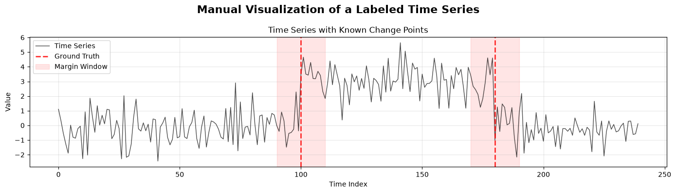
The first manual visualization problem is the plainest one: how do we show the time series together with the true change point and a tolerance window around it? This is the minimum plot a reader needs before any detector output is introduced.
In matplotlib, the API ingredients are just a line plot, one or more vertical lines, and one or more filled regions. The point of the example is not sophistication; it is visual clarity and explicitness.
manual_margin = 10
fig, ax = plt.subplots(1, 1, figsize=(14, 4), sharex=True)
fig.suptitle("Manual Visualization of a Labeled Time Series", fontsize=16, fontweight="bold")
ax.plot(
    np.arange(len(visualization_provider)),
    np.array(list(visualization_provider)),
    "k-",
    linewidth=1.0,
    alpha=0.7,
    label="Time Series",
)
for index, cp in enumerate(visualization_provider.change_points):
    ax.axvline(cp, color="red", linestyle="--", linewidth=2, alpha=0.8, label="Ground Truth" if index == 0 else "")
    ax.axvspan(
        cp - manual_margin, cp + manual_margin, alpha=0.1, color="red", label="Margin Window" if index == 0 else ""
    )
ax.set_title("Time Series with Known Change Points")
ax.set_xlabel("Time Index")
ax.set_ylabel("Value")
ax.grid(True, alpha=0.3)
ax.legend(loc="upper left")
plt.tight_layout()
fig.show()
3.2 Manual plotly timeseries plot
The same conceptual problem is worth solving in plotly because the backend supports hovering, zooming, and interactive legends. Seeing the same visual logic in a second backend helps separate plotting concepts from plotting library syntax.
The plotly version still uses the same ingredients: a line trace for the series, line shapes for true change points, and rectangle shapes for the margin windows. Only the backend-specific mechanics change.
fig = go.Figure()
fig.add_trace(
    go.Scatter(
        x=np.arange(len(visualization_provider)),
        y=np.array(list(visualization_provider)),
        mode="lines",
        name="Time Series",
        line={"color": "black", "width": 1.5},
        opacity=0.7,
    )
)
for cp in visualization_provider.change_points:
    fig.add_vrect(x0=cp - manual_margin, x1=cp + manual_margin, fillcolor="red", opacity=0.1, line_width=0)
    fig.add_vline(x=cp, line_color="red", line_dash="dash", line_width=2)
fig.update_layout(
    title="Manual Plotly Visualization of a Labeled Time Series",
    xaxis_title="Time Index",
    yaxis_title="Value",
    height=350,
)
fig
3.3 Manual matplotlib overview of series and detector output
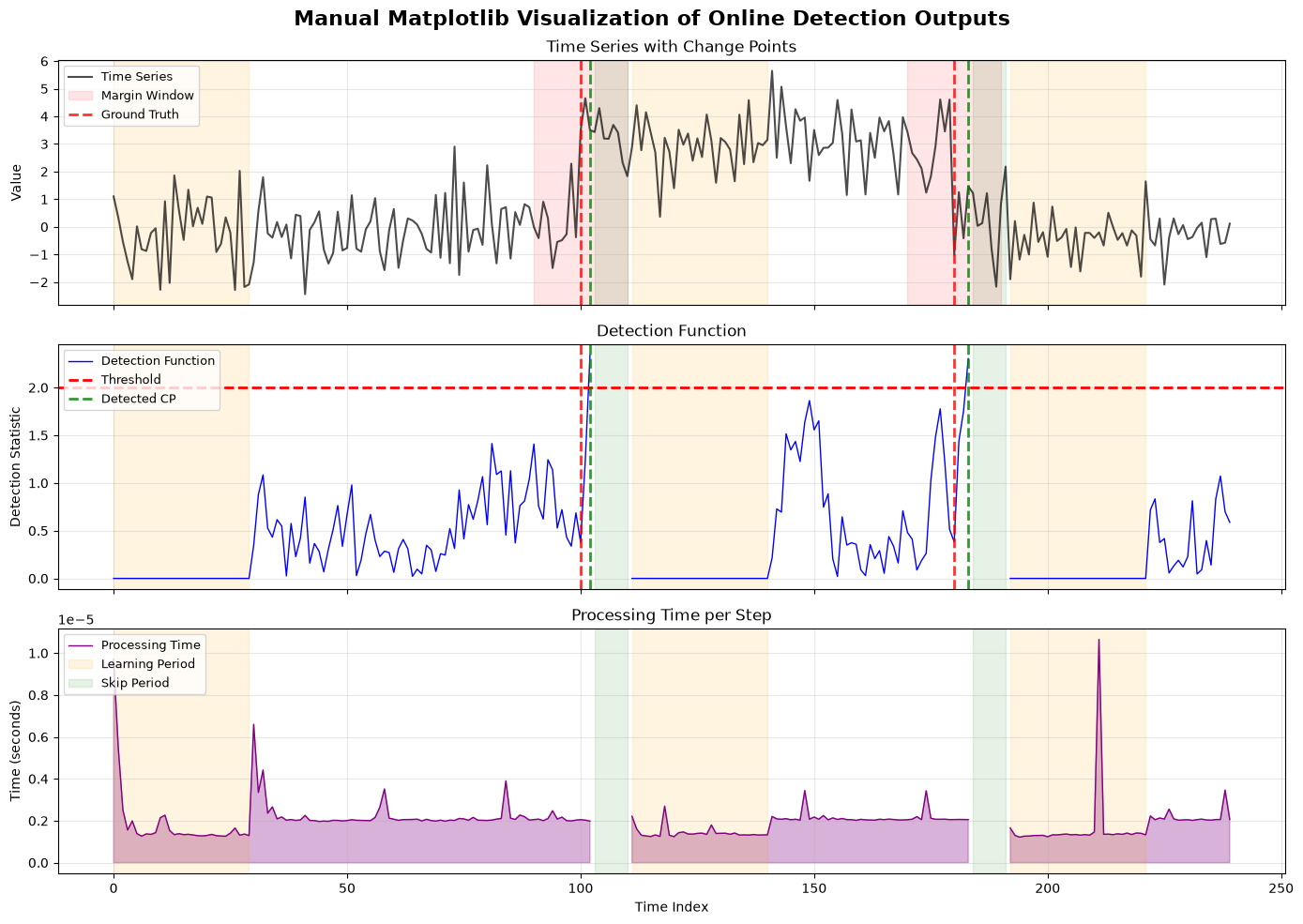
Once the raw labeled series is visible, the next problem is connecting it to the detector. A single plot of the time series is not enough if we want to explain why a detector fired or how close a threshold crossing came to the true transition.
This matplotlib example keeps the manual style but adds the detector-side outputs. The stacked layout mirrors the old tutorial: observations at the top, detection function in the middle, and processing time at the bottom.
fig, axes = plt.subplots(3, 1, figsize=(14, 10), sharex=True)
fig.suptitle("Manual Matplotlib Visualization of Online Detection Outputs", fontsize=16, fontweight="bold")
time_index = np.arange(len(visualization_provider))
trace_index = np.arange(len(visualization_trace.detection_function))

axes[0].plot(
    time_index, np.array(list(visualization_provider)), color="black", linewidth=1.5, alpha=0.7, label="Time Series"
)
axes[1].plot(
    trace_index, visualization_trace.detection_function, color="blue", linewidth=1.0, label="Detection Function"
)
axes[1].axhline(visualization_trace.threshold, color="red", linestyle="--", linewidth=2, label="Threshold")
axes[2].plot(trace_index, visualization_trace.processing_time, color="purple", linewidth=1.0, label="Processing Time")
axes[2].fill_between(trace_index, 0, visualization_trace.processing_time, color="purple", alpha=0.3)

for index, cp in enumerate(visualization_provider.change_points):
    axes[0].axvspan(
        cp - manual_margin, cp + manual_margin, color="red", alpha=0.1, label="Margin Window" if index == 0 else None
    )
    axes[0].axvline(
        cp, color="red", linestyle="--", linewidth=2, alpha=0.8, label="Ground Truth" if index == 0 else None
    )
    axes[1].axvline(cp, color="red", linestyle="--", linewidth=2, alpha=0.8)

for index, cp in enumerate(visualization_trace.signal_change_points):
    axes[0].axvline(cp, color="green", linestyle="--", linewidth=2, alpha=0.8)
    axes[1].axvline(
        cp, color="green", linestyle="--", linewidth=2, alpha=0.8, label="Detected CP" if index == 0 else None
    )

for period_index, (start, stop) in enumerate(manual_learning_periods):
    for ax in axes:
        ax.axvspan(
            start,
            stop,
            color="orange",
            alpha=0.12,
            label="Learning Period" if period_index == 0 and ax is axes[2] else None,
        )
for period_index, (start, stop) in enumerate(manual_skip_periods):
    for ax in axes:
        ax.axvspan(
            start, stop, color="green", alpha=0.10, label="Skip Period" if period_index == 0 and ax is axes[2] else None
        )

axes[0].set_title("Time Series with Change Points")
axes[0].set_ylabel("Value")
axes[1].set_title("Detection Function")
axes[1].set_ylabel("Detection Statistic")
axes[2].set_title("Processing Time per Step")
axes[2].set_xlabel("Time Index")
axes[2].set_ylabel("Time (seconds)")
for ax in axes:
    ax.grid(True, alpha=0.3)
    handles, labels = ax.get_legend_handles_labels()
    if labels:
        ax.legend(loc="upper left", fontsize=9)
plt.tight_layout()
plt.show()
3.4 Manual plotly overview of series and detector output
The same three-panel idea is useful in plotly, especially when the reader wants to inspect individual time steps interactively. This is the plotly twin of the previous example and should be read as the same message in a different backend.
The code uses make_subplots(...) so the layout remains parallel to the matplotlib example. That is the easiest way to keep backend comparisons visually honest.
fig = make_subplots(
    rows=3,
    cols=1,
    shared_xaxes=True,
    vertical_spacing=0.08,
    subplot_titles=("Time Series with Change Points", "Detection Function", "Processing Time per Step"),
)
time_index = np.arange(len(visualization_provider))
trace_index = np.arange(len(visualization_trace.detection_function))
fig.add_trace(
    go.Scatter(
        x=time_index,
        y=np.array(list(visualization_provider)),
        mode="lines",
        name="Time Series",
        line={"color": "black", "width": 1.5},
        opacity=0.7,
    ),
    row=1,
    col=1,
)
fig.add_trace(
    go.Scatter(
        x=trace_index,
        y=visualization_trace.detection_function,
        mode="lines",
        name="Detection Function",
        line={"color": "blue", "width": 1.0},
    ),
    row=2,
    col=1,
)
fig.add_trace(
    go.Scatter(
        x=[trace_index[0], trace_index[-1]],
        y=[visualization_trace.threshold, visualization_trace.threshold],
        mode="lines",
        name="Threshold",
        line={"color": "red", "width": 2, "dash": "dash"},
    ),
    row=2,
    col=1,
)
fig.add_trace(
    go.Scatter(
        x=trace_index,
        y=visualization_trace.processing_time,
        mode="lines",
        name="Processing Time",
        line={"color": "purple", "width": 1.0},
        fill="tozeroy",
        opacity=0.7,
    ),
    row=3,
    col=1,
)

ground_truth_component_go = (
    VerticalLineVisualComponent(DrawBackend.PLOTLY)
    .set_lines(list(visualization_provider.change_points))
    .set_style(color="red", linestyle="dash", linewidth=2, alpha=0.8, label="Ground Truth", legend=True)
)
detected_component_go = (
    VerticalLineVisualComponent(DrawBackend.PLOTLY)
    .set_lines(visualization_trace.signal_change_points)
    .set_style(color="green", linestyle="dash", linewidth=2, alpha=0.8, label="Detected CP", legend=True)
)
margin_component_go = (
    VerticalFillComponent(DrawBackend.PLOTLY)
    .set_regions([(cp - manual_margin, cp + manual_margin) for cp in visualization_provider.change_points])
    .set_style(fill_color="red", fill_alpha=0.1, label="Margin Window", legend=True)
)
learning_component_go = (
    VerticalFillComponent(DrawBackend.PLOTLY)
    .set_regions(manual_learning_periods)
    .set_style(fill_color="orange", fill_alpha=0.12, label="Learning Period", legend=True)
)
skip_component_go = (
    VerticalFillComponent(DrawBackend.PLOTLY)
    .set_regions(manual_skip_periods)
    .set_style(fill_color="green", fill_alpha=0.10, label="Skip Period", legend=True)
)

ground_truth_component_go.draw(fig, (1, 1), add_legend=True)
ground_truth_component_go.draw(fig, (2, 1), add_legend=False)
detected_component_go.draw(fig, (1, 1), add_legend=False)
detected_component_go.draw(fig, (2, 1), add_legend=True)
margin_component_go.draw(fig, (1, 1), add_legend=True)
for target_axes in ((1, 1), (2, 1), (3, 1)):
    learning_component_go.draw(fig, target_axes, add_legend=target_axes == (3, 1))
    skip_component_go.draw(fig, target_axes, add_legend=target_axes == (3, 1))

fig.update_layout(title="Manual Plotly Visualization of Online Detection Outputs", height=900, showlegend=True)
fig
Summary of Section 3: Manual plotting makes the visualization ingredients obvious: raw signal, true boundaries, tolerance windows, detection statistics, and timing. Those ingredients are exactly what the reusable visualization classes will automate in the next sections.
Section 4. Reusable Visual Components
The manual plots made the necessary visual ingredients explicit, but writing those ingredients by hand every time is repetitive. The next problem is reuse: how do we express “draw these change-point lines” or “fill these skip regions” once and then reuse that logic across figures and backends?
The visualization components solve exactly that problem. They are small, backend-aware building blocks that draw one kind of annotation onto one subplot.
4.1 VerticalLineVisualComponent and VerticalFillComponent in matplotlib
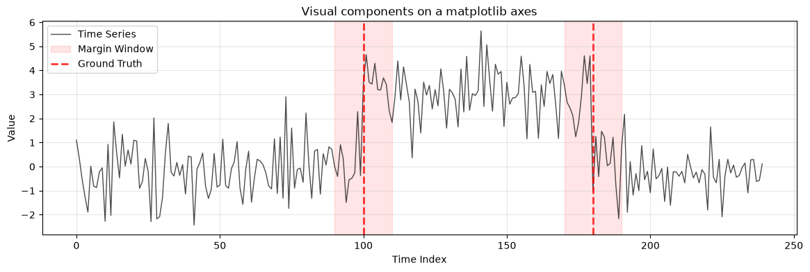
The motivation here is composability. Instead of calling axvline(...) and axvspan(...) directly every time, we package those visual ideas as reusable components with their own style and legend configuration.
The matplotlib API for these components is straightforward: set the backend, configure lines or regions, optionally assign a legend label, and draw the component onto one axes object.
line_component = VerticalLineVisualComponent(DrawBackend.MATPLOTLIB)
line_component.set_lines(visualization_provider.change_points).set_style(
    color="red", linestyle="dash", linewidth=2, alpha=0.8, label="Ground Truth", legend=True
)
fill_component = VerticalFillComponent(DrawBackend.MATPLOTLIB)
fill_component.set_regions(
    [(cp - manual_margin, cp + manual_margin) for cp in visualization_provider.change_points]
).set_style(fill_color="red", fill_alpha=0.1, label="Margin Window", legend=True)

fig, ax = plt.subplots(figsize=(14, 4))
ax.plot(
    np.arange(len(visualization_provider)),
    np.array(list(visualization_provider)),
    color="black",
    linewidth=1.0,
    alpha=0.7,
    label="Time Series",
)
fill_component.draw(fig, ax, add_legend=True)
line_component.draw(fig, ax, add_legend=True)
ax.set_title("Visual components on a matplotlib axes")
ax.set_xlabel("Time Index")
ax.set_ylabel("Value")
ax.grid(True, alpha=0.3)
ax.legend(loc="upper left")
plt.show()
4.2 VerticalLineVisualComponent and VerticalFillComponent in plotly
The same composability problem exists in plotly, but now the components also need to work with subplot positions rather than axes objects. This is a good example of why a backend-aware abstraction is useful: the conceptual annotation stays the same while the low-level draw mechanics change.
The plotly API is parallel to the matplotlib one. The component configuration is almost identical; the main difference is that the draw target is a (row, col) subplot coordinate.
line_component_go = VerticalLineVisualComponent(DrawBackend.PLOTLY)
line_component_go.set_lines(visualization_provider.change_points).set_style(
    color="red", linestyle="dash", linewidth=2, alpha=0.8, label="Ground Truth", legend=True
)
fill_component_go = VerticalFillComponent(DrawBackend.PLOTLY)
fill_component_go.set_regions(
    [(cp - manual_margin, cp + manual_margin) for cp in visualization_provider.change_points]
).set_style(fill_color="red", fill_alpha=0.1, label="Margin Window", legend=True)

fig = make_subplots(rows=1, cols=1, subplot_titles=("Visual components on a plotly subplot",))
fig.add_trace(
    go.Scatter(
        x=np.arange(len(visualization_provider)),
        y=np.array(list(visualization_provider)),
        mode="lines",
        name="Time Series",
        line={"color": "black", "width": 1.5},
        opacity=0.7,
    ),
    row=1,
    col=1,
)
fill_component_go.draw(fig, (1, 1), add_legend=True)
line_component_go.draw(fig, (1, 1), add_legend=True)
fig.update_layout(height=350)
fig
4.3 Learning and skip periods as reusable regions
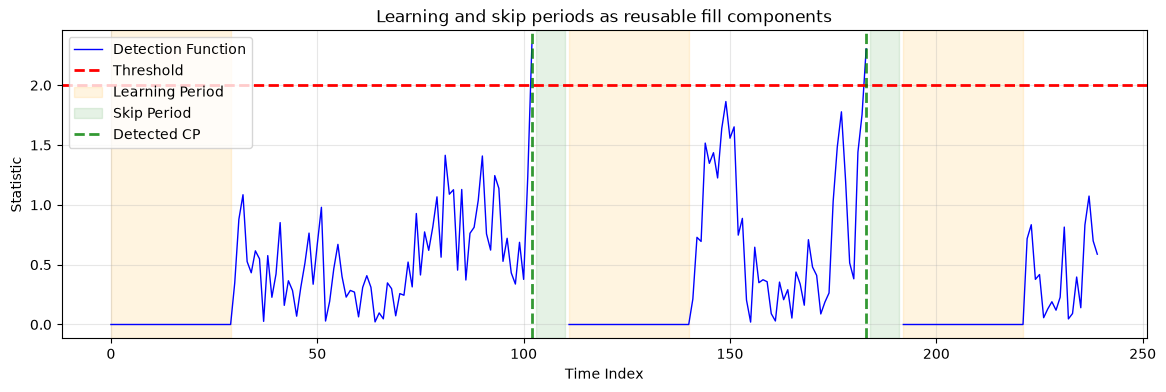
Learning periods and skip periods are interval annotations rather than point annotations. They use the same VerticalFillComponent abstraction as margin windows, but they communicate detector runtime state rather than ground truth.
This example draws them on the detection-function panel, where their interpretation is most direct: learning periods explain why early statistics should not be treated like ordinary detections, and skip periods explain why the detector suppresses immediate repeated alarms after a reset.
learning_component = VerticalFillComponent(DrawBackend.MATPLOTLIB)
learning_component.set_regions(manual_learning_periods).set_style(
    fill_color="orange", fill_alpha=0.12, label="Learning Period", legend=True
)
skip_component = VerticalFillComponent(DrawBackend.MATPLOTLIB)
skip_component.set_regions(manual_skip_periods).set_style(
    fill_color="green", fill_alpha=0.10, label="Skip Period", legend=True
)
detected_component = VerticalLineVisualComponent(DrawBackend.MATPLOTLIB)
detected_component.set_lines(visualization_trace.signal_change_points).set_style(
    color="green", linestyle="dash", linewidth=2, alpha=0.8, label="Detected CP", legend=True
)

fig, ax = plt.subplots(figsize=(14, 4))
ax.plot(visualization_trace.detection_function, color="blue", linewidth=1.0, label="Detection Function")
ax.axhline(visualization_trace.threshold, color="red", linestyle="--", linewidth=2, label="Threshold")
learning_component.draw(fig, ax, add_legend=True)
skip_component.draw(fig, ax, add_legend=True)
detected_component.draw(fig, ax, add_legend=True)
ax.set_title("Learning and skip periods as reusable fill components")
ax.set_xlabel("Time Index")
ax.set_ylabel("Statistic")
ax.grid(True, alpha=0.3)
ax.legend(loc="upper left")
plt.show()
Summary of Section 4: Visual components are the reusable annotation layer of the plotting system. They let you express repeated visual ideas once, including point markers for change points and interval fills for margins, learning periods, and skip periods.
Section 5. Direct Visualizers
Manual plotting and low-level components are useful, but the next problem is higher-level reuse. We do not just want reusable lines and fills; we want reusable “draw the timeseries” and “draw the trace” logic as well.
The direct visualizer classes solve that problem. They are still explicit enough to configure carefully, but high-level enough that the figure-building code becomes much shorter than the manual equivalent.
5.1 UnivariateTimeseriesVisualizer and OnlineTraceVisualizer in matplotlib
The first direct-visualizer problem is producing the same three-panel figure we drew manually, but now through dedicated plotting classes. The motivation is not shorter code for its own sake; it is consistency across repeated uses.
The API works in two stages. First, configure the visualizers with the provider or trace and any style options. Second, draw them into a figure whose axes mapping names match the required subplot names.
ground_truth_component = (
    VerticalLineVisualComponent(DrawBackend.MATPLOTLIB)
    .set_lines(visualization_provider.change_points)
    .set_style(color="red", linestyle="dash", linewidth=2, alpha=0.8, label="Ground Truth", legend=True)
)
detected_component = (
    VerticalLineVisualComponent(DrawBackend.MATPLOTLIB)
    .set_lines(visualization_trace.signal_change_points)
    .set_style(color="green", linestyle="dash", linewidth=2, alpha=0.8, label="Detected CP", legend=True)
)
timeseries_region_components = [
    VerticalFillComponent(DrawBackend.MATPLOTLIB)
    .set_regions([(cp - manual_margin, cp + manual_margin) for cp in visualization_provider.change_points])
    .set_style(fill_color="red", fill_alpha=0.1, label="Margin Window", legend=True),
]
detection_region_components = [
    VerticalFillComponent(DrawBackend.MATPLOTLIB)
    .set_regions(manual_learning_periods)
    .set_style(fill_color="orange", fill_alpha=0.12, label="Learning Period", legend=True),
    VerticalFillComponent(DrawBackend.MATPLOTLIB)
    .set_regions(manual_skip_periods)
    .set_style(fill_color="green", fill_alpha=0.10, label="Skip Period", legend=True),
]

backend = DrawBackend.MATPLOTLIB
timeseries_visualizer = UnivariateTimeseriesVisualizer(backend=backend)
timeseries_visualizer.set_data_provider(visualization_provider)
(
    timeseries_visualizer.set_plot_opts(
        title="Time Series with Change Points", xlabel="Time Index", ylabel="Value", grid=True
    ).set_draw_opts(color="black", linewidth=1.5, alpha=0.7, label="Time Series")
)

trace_visualizer = OnlineTraceVisualizer(
    backend=backend,
    state_visualizer=DummyStateVisualizer[ShewhartControlChartState](backend=backend),
)
trace_visualizer.set_trace(visualization_trace)
(
    trace_visualizer.set_detection_func_plot_opts(
        title="Detection Function", xlabel="Time Index", ylabel="Detection Statistic", grid=True
    )
    .set_detection_func_draw_opts(color="blue", linewidth=1, label="Detection Function")
    .set_threshold_draw_opts(color="red", linestyle="dash", linewidth=2, alpha=0.8, label="Threshold")
    .set_processing_time_plot_opts(
        title="Processing Time per Step", xlabel="Time Index", ylabel="Time (seconds)", grid=True
    )
    .set_processing_time_draw_opts(color="purple", linewidth=1, fill_alpha=0.3, label="Processing Time")
)

fig, axes = plt.subplots(3, 1, figsize=(14, 10), sharex=True)
fig.suptitle("Direct visualizers (matplotlib)", fontsize=16, fontweight="bold")
ax_mapping = {"timeseries": axes[0], "detection_function": axes[1], "processing_time": axes[2]}
fig = timeseries_visualizer.draw(figure=fig, axes=ax_mapping)
fig = trace_visualizer.draw(figure=fig, axes=ax_mapping)
ground_truth_component.draw(fig, axes[0], add_legend=True)
ground_truth_component.draw(fig, axes[1], add_legend=False)
detected_component.draw(fig, axes[0], add_legend=False)
detected_component.draw(fig, axes[1], add_legend=True)
for component in timeseries_region_components:
    component.draw(fig, axes[0], add_legend=True)
for component in detection_region_components:
    for index, ax in enumerate(axes):
        component.draw(fig, ax, add_legend=index == 2)
for ax in axes:
    handles, labels = ax.get_legend_handles_labels()
    if labels:
        ax.legend(loc="upper left", fontsize=9)
plt.tight_layout()
plt.show()
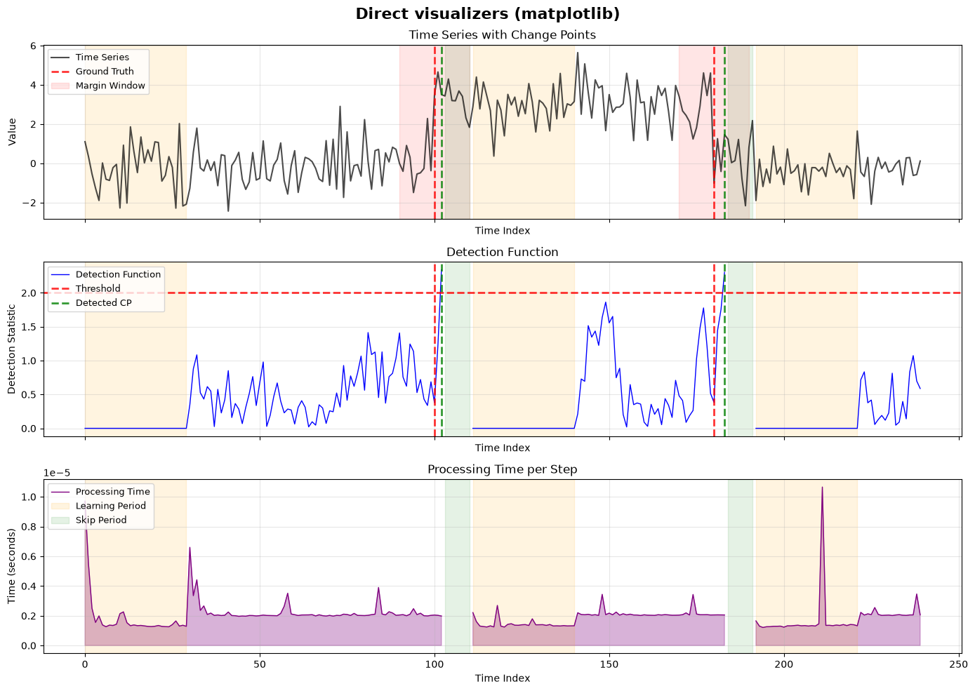
5.2 UnivariateTimeseriesVisualizer and OnlineTraceVisualizer in plotly
The same direct-visualizer problem should look as parallel as possible in plotly. That is why this subsection repeats the same conceptual figure and almost the same configuration choices, but swaps the backend and subplot mapping.
Reading the two code cells side by side is useful because it shows what really changes with the backend and what stays conceptually identical across both rendering systems.
ground_truth_component_go = (
    VerticalLineVisualComponent(DrawBackend.PLOTLY)
    .set_lines(visualization_provider.change_points)
    .set_style(color="red", linestyle="dash", linewidth=2, alpha=0.8, label="Ground Truth", legend=True)
)
detected_component_go = (
    VerticalLineVisualComponent(DrawBackend.PLOTLY)
    .set_lines(visualization_trace.signal_change_points)
    .set_style(color="green", linestyle="dash", linewidth=2, alpha=0.8, label="Detected CP", legend=True)
)
timeseries_region_components_go = [
    VerticalFillComponent(DrawBackend.PLOTLY)
    .set_regions([(cp - manual_margin, cp + manual_margin) for cp in visualization_provider.change_points])
    .set_style(fill_color="red", fill_alpha=0.1, label="Margin Window", legend=True),
]
detection_region_components_go = [
    VerticalFillComponent(DrawBackend.PLOTLY)
    .set_regions(manual_learning_periods)
    .set_style(fill_color="orange", fill_alpha=0.12, label="Learning Period", legend=True),
    VerticalFillComponent(DrawBackend.PLOTLY)
    .set_regions(manual_skip_periods)
    .set_style(fill_color="green", fill_alpha=0.10, label="Skip Period", legend=True),
]

backend = DrawBackend.PLOTLY
timeseries_visualizer_go = UnivariateTimeseriesVisualizer(backend=backend)
timeseries_visualizer_go.set_data_provider(visualization_provider)
(
    timeseries_visualizer_go.set_plot_opts(
        title="Time Series with Change Points", xlabel="Time Index", ylabel="Value", grid=True
    ).set_draw_opts(color="black", linewidth=1.5, alpha=0.7, label="Time Series")
)

trace_visualizer_go = OnlineTraceVisualizer(
    backend=backend,
    state_visualizer=DummyStateVisualizer[ShewhartControlChartState](backend=backend),
)
trace_visualizer_go.set_trace(visualization_trace)
(
    trace_visualizer_go.set_detection_func_plot_opts(
        title="Detection Function", xlabel="Time Index", ylabel="Detection Statistic", grid=True
    )
    .set_detection_func_draw_opts(color="blue", linewidth=1, label="Detection Function")
    .set_threshold_draw_opts(color="red", linestyle="dash", linewidth=2, alpha=0.8, label="Threshold")
    .set_processing_time_plot_opts(
        title="Processing Time per Step", xlabel="Time Index", ylabel="Time (seconds)", grid=True
    )
    .set_processing_time_draw_opts(color="purple", linewidth=1, fill_alpha=0.3, label="Processing Time")
)

fig = make_subplots(
    rows=3,
    cols=1,
    shared_xaxes=True,
    vertical_spacing=0.1,
    subplot_titles=("Time Series with Change Points", "Detection Function", "Processing Time per Step"),
)
ax_mapping = {"timeseries": (1, 1), "detection_function": (2, 1), "processing_time": (3, 1)}
fig = timeseries_visualizer_go.draw(figure=fig, axes=ax_mapping)
fig = trace_visualizer_go.draw(figure=fig, axes=ax_mapping)
ground_truth_component_go.draw(fig, (1, 1), add_legend=True)
ground_truth_component_go.draw(fig, (2, 1), add_legend=False)
detected_component_go.draw(fig, (1, 1), add_legend=False)
detected_component_go.draw(fig, (2, 1), add_legend=True)
for component in timeseries_region_components_go:
    component.draw(fig, (1, 1), add_legend=True)
for component in detection_region_components_go:
    for target_axes in ((1, 1), (2, 1), (3, 1)):
        component.draw(fig, target_axes, add_legend=target_axes == (3, 1))
fig.update_layout(title="Direct visualizers (plotly)", height=900, showlegend=True)
fig
5.3 Custom Shewhart state visualizer in matplotlib
The next visualization problem is algorithm state. A detection statistic alone does not explain how the Shewhart algorithm’s internal estimates evolved. The old tutorial had a custom state-visualizer example, and that idea is still valuable.
ShewhartStateVisualizer solves this by rendering running means, control bands, and window means from the stored ShewhartControlChartState snapshots. In matplotlib, that means we need one extra subplot mapping entry dedicated to the state panel.
state_visualizer = ShewhartStateVisualizer(DrawBackend.MATPLOTLIB)
state_visualizer.set_plot_opts(title="Shewhart State Evolution", xlabel="Time Index", ylabel="Value", grid=True)
state_visualizer.set_band_opts(band_size=3.0)

trace_visualizer_state = OnlineTraceVisualizer(
    backend=DrawBackend.MATPLOTLIB,
    state_visualizer=state_visualizer,
)
trace_visualizer_state.set_trace(visualization_trace)

fig, axes = plt.subplots(4, 1, figsize=(14, 12), sharex=True)
ax_mapping = {
    "timeseries": axes[0],
    "detection_function": axes[1],
    "processing_time": axes[2],
    "shewhart_state": axes[3],
}
fig = timeseries_visualizer.draw(figure=fig, axes=ax_mapping)
fig = trace_visualizer_state.draw(figure=fig, axes=ax_mapping)
ground_truth_component.draw(fig, axes[0], add_legend=True)
ground_truth_component.draw(fig, axes[1], add_legend=False)
for index, ax in enumerate((axes[0], axes[1], axes[3])):
    detected_component.draw(fig, ax, add_legend=index == 1)
for component in timeseries_region_components:
    component.draw(fig, axes[0], add_legend=True)
for component in detection_region_components:
    for index, ax in enumerate(axes):
        component.draw(fig, ax, add_legend=index == 2)
for ax in axes:
    handles, labels = ax.get_legend_handles_labels()
    if labels:
        ax.legend(loc="upper left", fontsize=9)
plt.tight_layout()
plt.show()
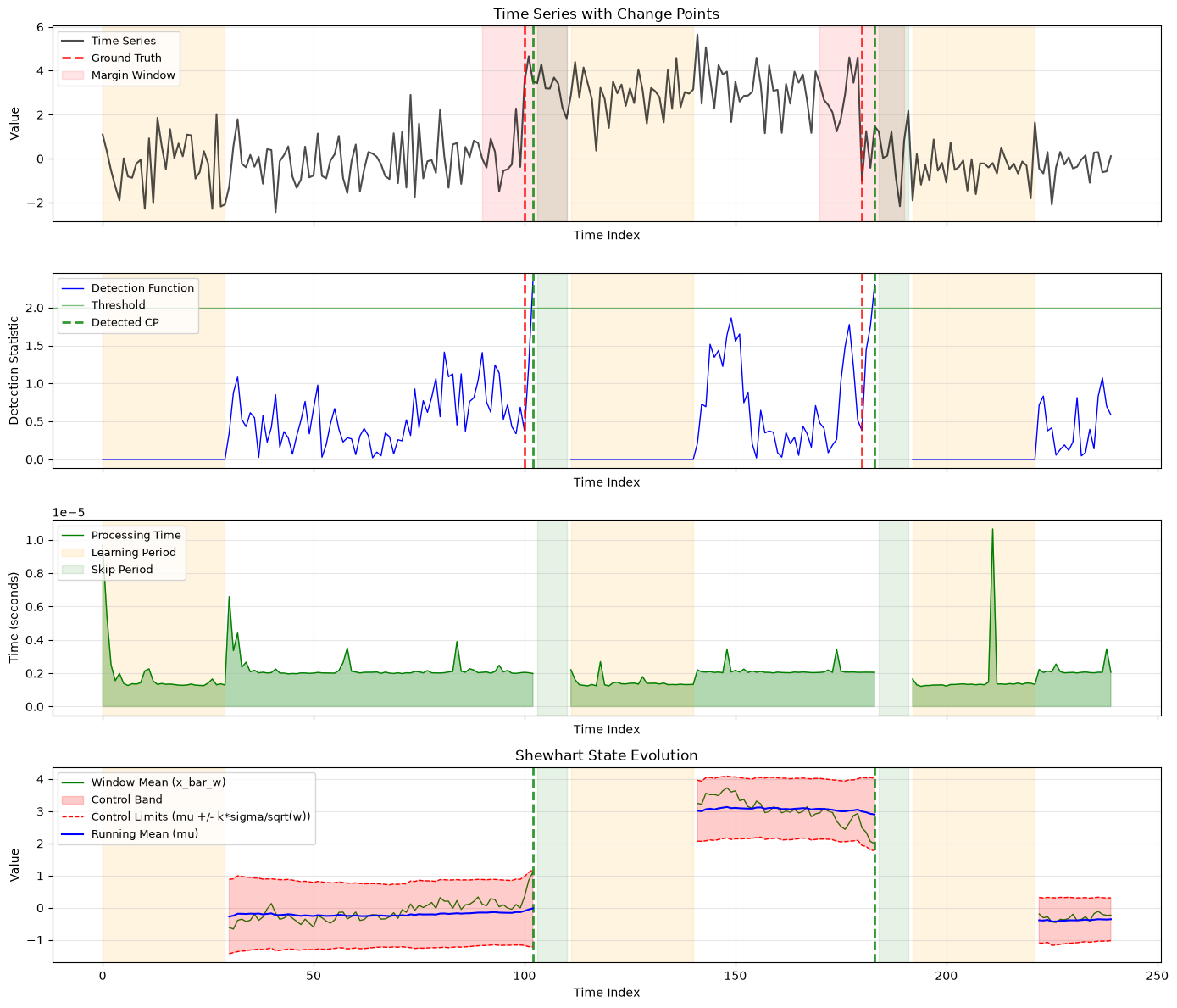
5.4 Custom Shewhart state visualizer in plotly
The same state-evolution problem is worth solving in plotly because interactive hovering can make state trajectories easier to inspect at specific steps. The conceptual content of the plot is unchanged; only the rendering backend differs.
As before, the important API detail is the subplot mapping. The state visualizer declares its own axis name, so the figure layout has to provide a subplot position for that axis explicitly.
state_visualizer_go = ShewhartStateVisualizer(DrawBackend.PLOTLY)
state_visualizer_go.set_plot_opts(title="Shewhart State Evolution", xlabel="Time Index", ylabel="Value", grid=True)
state_visualizer_go.set_band_opts(band_size=3.0)

trace_visualizer_state_go = OnlineTraceVisualizer(
    backend=DrawBackend.PLOTLY,
    state_visualizer=state_visualizer_go,
)
trace_visualizer_state_go.set_trace(visualization_trace)

fig = make_subplots(
    rows=4,
    cols=1,
    shared_xaxes=True,
    vertical_spacing=0.08,
    subplot_titles=(
        "Time Series with Change Points",
        "Detection Function",
        "Processing Time per Step",
        "Shewhart State Evolution",
    ),
)
ax_mapping = {
    "timeseries": (1, 1),
    "detection_function": (2, 1),
    "processing_time": (3, 1),
    "shewhart_state": (4, 1),
}
fig = timeseries_visualizer_go.draw(figure=fig, axes=ax_mapping)
fig = trace_visualizer_state_go.draw(figure=fig, axes=ax_mapping)
ground_truth_component_go.draw(fig, (1, 1), add_legend=True)
ground_truth_component_go.draw(fig, (2, 1), add_legend=False)
for target_axes in ((1, 1), (2, 1), (4, 1)):
    detected_component_go.draw(fig, target_axes, add_legend=target_axes == (2, 1))
for component in timeseries_region_components_go:
    component.draw(fig, (1, 1), add_legend=True)
for component in detection_region_components_go:
    for target_axes in ((1, 1), (2, 1), (3, 1), (4, 1)):
        component.draw(fig, target_axes, add_legend=target_axes == (3, 1))
fig.update_layout(title="Custom Shewhart state visualizer (plotly)", height=1200, showlegend=True)
fig
Summary of Section 5: Direct visualizers raise the abstraction level from “draw one annotation” to “draw one semantic panel”. They are detailed enough to customize carefully, but high-level enough to keep repeated plotting code consistent across runs and across backends.
Section 6. Multivariate Time-Series Visualizers
The univariate examples show the basic visualization architecture, but many practical detection problems involve several signals evolving together. The multivariate API now has two intentionally different designs.
PlainMultivariateTimeseriesVisualizer is dimension-oriented: one subplot per dimension, simple provider assumptions, and an axes=[...] configuration style. RichMultivariateTimeseriesVisualizer is plot-oriented: it is pandas-first, uses explicit logical plot names and series names, supports optional custom time columns, and can place selected series on a twin y-axis.
6.1 Preparing multivariate providers
The first multivariate problem is getting one common source that can drive both visualizer styles. We build one synthetic three-feature series, then derive both a plain labeled provider and a pandas-backed labeled provider from the same generated data.
To demonstrate set_time_column(...), we also create a pandas-backed variant with an artificial elapsed-time column. That lets us compare positional x-values with an explicit custom time axis without changing the underlying signals.
multivariate_visualization_scenario = ScenarioSpec(
    name="multivariate_visualization_demo",
    segments=(
        SegmentSpec(plan_name="baseline", length=70),
        SegmentSpec(plan_name="shifted", length=60),
        SegmentSpec(plan_name="recovery", length=50),
    ),
    plans=frozendict(
        baseline=SegmentPlan(
            distribution=IndependentColumnsSpec(
                columns=frozendict(
                    sensor_a=NormalSpec(mean=0.0, std=0.6),
                    sensor_b=NormalSpec(mean=2.0, std=0.4),
                    load=NormalSpec(mean=20.0, std=1.2),
                )
            ),
            state=StateDescriptor(type="baseline"),
            name="baseline",
        ),
        shifted=SegmentPlan(
            distribution=IndependentColumnsSpec(
                columns=frozendict(
                    sensor_a=NormalSpec(mean=2.8, std=0.7),
                    sensor_b=NormalSpec(mean=0.8, std=0.5),
                    load=NormalSpec(mean=34.0, std=1.6),
                )
            ),
            state=StateDescriptor(type="shifted"),
            name="shifted",
        ),
        recovery=SegmentPlan(
            distribution=IndependentColumnsSpec(
                columns=frozendict(
                    sensor_a=NormalSpec(mean=1.1, std=0.5),
                    sensor_b=NormalSpec(mean=1.7, std=0.4),
                    load=NormalSpec(mean=24.0, std=1.1),
                )
            ),
            state=StateDescriptor(type="recovery"),
            name="recovery",
        ),
    ),
)
multivariate_visualization_series = GenericSeriesGenerator(seed=23).generate_from_scenario(
    multivariate_visualization_scenario,
    name="multivariate_visualization_series",
)
multivariate_plain_provider = build_plain_multivariate_labeled_data(
    multivariate_visualization_series,
    name="multivariate_plain_provider",
)
multivariate_pandas_provider = build_pandas_labeled_data(
    multivariate_visualization_series,
    name="multivariate_pandas_provider",
)
multivariate_pandas_provider_with_time = multivariate_pandas_provider.create_feature_column(
    name="elapsed_seconds",
    mapping=lambda row: row.name * 0.5,
)
multivariate_trace_provider = build_plain_univariate_labeled_data(
    multivariate_visualization_series,
    feature_name="sensor_a",
    name="multivariate_trace_provider",
)
multivariate_detector = OnlineResetDetector(
    ShewhartControlChart(learning_period_size=30, window_size=10),
    threshold=2.0,
    skip_period=8,
    collect_states=True,
)
multivariate_visualization_trace = multivariate_detector.detect(multivariate_trace_provider)

print("Plain provider dimensionality:", multivariate_plain_provider.raw_data.shape[1])
print("Pandas feature columns:", list(multivariate_pandas_provider.feature_columns))
print(
    "Pandas feature columns with time:",
    list(multivariate_pandas_provider_with_time.feature_columns),
)
print("Multivariate trace change points:", multivariate_visualization_trace.signal_change_points)
Plain provider dimensionality: 3
Pandas feature columns: ['sensor_a', 'sensor_b', 'load']
Pandas feature columns with time: ['sensor_a', 'sensor_b', 'load', 'elapsed_seconds']
Multivariate trace change points: [72, 113]
6.2 PlainMultivariateTimeseriesVisualizer in matplotlib
The plain multivariate visualizer preserves the simple mental model: one subplot per dimension. This makes it a good fit for quick inspection of multivariate arrays when each feature deserves its own panel.
This matplotlib example uses integer axis selectors and keeps the styling close to the univariate examples, but now repeated once per dimension.
plain_multivariate_visualizer = PlainMultivariateTimeseriesVisualizer(
    DrawBackend.MATPLOTLIB,
    dimensionality=3,
)
plain_multivariate_visualizer.set_data_provider(multivariate_plain_provider)
plain_multivariate_visualizer.set_plot_opts(axes=[0, 1, 2], xlabel="Sample Index", grid=True)
plain_multivariate_visualizer.set_plot_opts(axes=[0], title="Sensor A", ylabel="Sensor A")
plain_multivariate_visualizer.set_plot_opts(axes=[1], title="Sensor B", ylabel="Sensor B")
plain_multivariate_visualizer.set_plot_opts(axes=[2], title="Load", ylabel="Load")
plain_multivariate_visualizer.set_draw_opts(axes=[0], color="tab:blue", label="sensor_a")
plain_multivariate_visualizer.set_draw_opts(axes=[1], color="tab:orange", label="sensor_b")
plain_multivariate_visualizer.set_draw_opts(axes=[2], color="tab:green", label="load")

fig, axes = plt.subplots(3, 1, figsize=(14, 9), sharex=True)
fig.suptitle("PlainMultivariateTimeseriesVisualizer (matplotlib)", fontsize=16, fontweight="bold")
plain_multivariate_visualizer.draw(
    figure=fig,
    axes={
        "timeseries_0": axes[0],
        "timeseries_1": axes[1],
        "timeseries_2": axes[2],
    },
)
for ax in axes:
    ax.legend(loc="upper left")
plt.tight_layout()
plt.show()
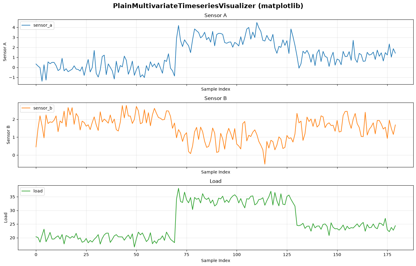
6.3 PlainMultivariateTimeseriesVisualizer in plotly
The same plain design works in plotly as well. Here the useful extra demonstration is named axis selection: because the pandas-backed provider exposes feature columns, the plain visualizer can resolve subplot styling by column name instead of only by integer index.
plain_multivariate_visualizer_go = PlainMultivariateTimeseriesVisualizer(
    DrawBackend.PLOTLY,
    dimensionality=3,
)
plain_multivariate_visualizer_go.set_data_provider(multivariate_pandas_provider)
plain_multivariate_visualizer_go.set_plot_opts(axes=["sensor_a", "sensor_b", "load"], xlabel="Sample Index", grid=True)
plain_multivariate_visualizer_go.set_plot_opts(axes=["sensor_a"], title="Sensor A", ylabel="Sensor A")
plain_multivariate_visualizer_go.set_plot_opts(axes=["sensor_b"], title="Sensor B", ylabel="Sensor B")
plain_multivariate_visualizer_go.set_plot_opts(axes=["load"], title="Load", ylabel="Load")
plain_multivariate_visualizer_go.set_draw_opts(axes=["sensor_a"], color="tab:blue", label="sensor_a")
plain_multivariate_visualizer_go.set_draw_opts(axes=["sensor_b"], color="tab:orange", label="sensor_b")
plain_multivariate_visualizer_go.set_draw_opts(axes=["load"], color="tab:green", label="load")

fig = make_subplots(
    rows=3,
    cols=1,
    shared_xaxes=True,
    vertical_spacing=0.08,
    subplot_titles=("Sensor A", "Sensor B", "Load"),
)
plain_multivariate_visualizer_go.draw(
    figure=fig,
    axes={
        "timeseries_0": (1, 1),
        "timeseries_1": (2, 1),
        "timeseries_2": (3, 1),
    },
)
fig.update_layout(title="PlainMultivariateTimeseriesVisualizer (plotly)", height=900, showlegend=True)
fig
6.4 RichMultivariateTimeseriesVisualizer in matplotlib without a custom time column
The rich multivariate visualizer changes the organizing idea. Instead of treating dimensions as the primary concept, it lets us define logical plots and then bind named series into them.
This first rich example keeps the x-axis positional. That means the visualizer uses row index by default, which is often enough when the data is sampled uniformly and an explicit timestamp column is unnecessary.
rich_multivariate_visualizer = RichMultivariateTimeseriesVisualizer(DrawBackend.MATPLOTLIB)
rich_multivariate_visualizer.set_data_provider(multivariate_pandas_provider)
rich_multivariate_visualizer.define_plot(
    "signals",
    title="Signals on a shared logical plot",
    xlabel="Sample Index",
    ylabel="Signal Value",
    grid=True,
)
rich_multivariate_visualizer.define_plot(
    "load",
    title="Load on a separate logical plot",
    xlabel="Sample Index",
    ylabel="Load",
    grid=True,
)
rich_multivariate_visualizer.add_series("signals", "sensor_a", column="sensor_a", color="tab:blue")
rich_multivariate_visualizer.add_series("signals", "sensor_b", column="sensor_b", color="tab:orange")
rich_multivariate_visualizer.add_series("load", "load", column="load", color="tab:green")

fig, axes = plt.subplots(2, 1, figsize=(14, 8), sharex=True)
fig.suptitle("RichMultivariateTimeseriesVisualizer (matplotlib, positional x)", fontsize=16, fontweight="bold")
rich_multivariate_visualizer.draw(
    figure=fig,
    axes={
        "signals": axes[0],
        "load": axes[1],
    },
)
for ax in axes:
    handles, labels = ax.get_legend_handles_labels()
    if labels:
        ax.legend(loc="upper left")
plt.tight_layout()
plt.show()
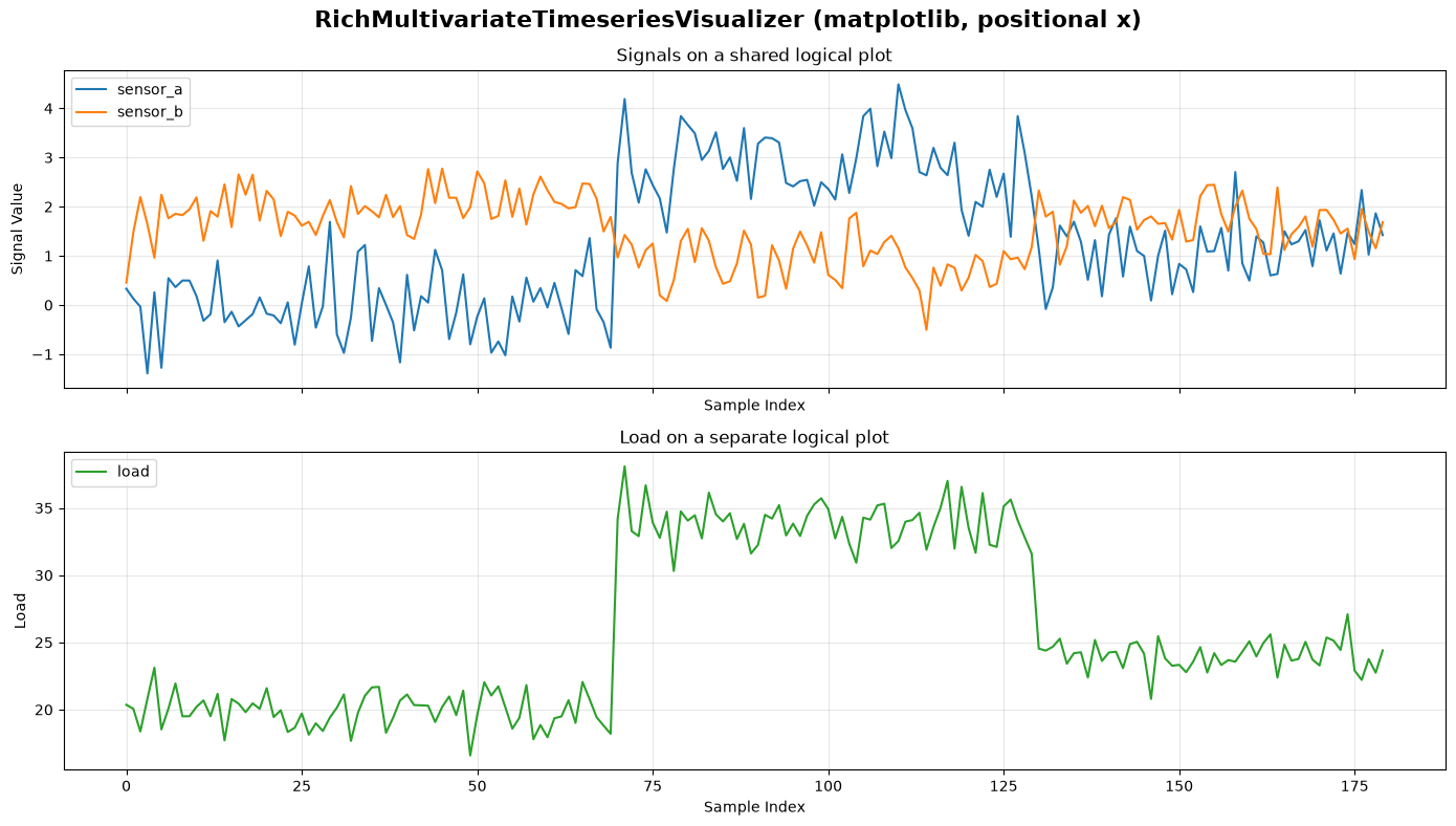
6.5 RichMultivariateTimeseriesVisualizer in plotly without a custom time column
The same logical-plot API works in plotly. This version keeps the same positional x-axis assumption, so the backend difference is purely about rendering and interactivity rather than data binding.
rich_multivariate_visualizer_go = RichMultivariateTimeseriesVisualizer(DrawBackend.PLOTLY)
rich_multivariate_visualizer_go.set_data_provider(multivariate_pandas_provider)
rich_multivariate_visualizer_go.define_plot(
    "signals",
    title="Signals on a shared logical plot",
    xlabel="Sample Index",
    ylabel="Signal Value",
    grid=True,
)
rich_multivariate_visualizer_go.define_plot(
    "load",
    title="Load on a separate logical plot",
    xlabel="Sample Index",
    ylabel="Load",
    grid=True,
)
rich_multivariate_visualizer_go.add_series("signals", "sensor_a", column="sensor_a", color="tab:blue")
rich_multivariate_visualizer_go.add_series("signals", "sensor_b", column="sensor_b", color="tab:orange")
rich_multivariate_visualizer_go.add_series("load", "load", column="load", color="tab:green")

fig = make_subplots(
    rows=2,
    cols=1,
    shared_xaxes=True,
    vertical_spacing=0.08,
    subplot_titles=("Signals on a shared logical plot", "Load on a separate logical plot"),
)
rich_multivariate_visualizer_go.draw(
    figure=fig,
    axes={
        "signals": (1, 1),
        "load": (2, 1),
    },
)
fig.update_layout(title="RichMultivariateTimeseriesVisualizer (plotly, positional x)", height=800, showlegend=True)
fig
6.6 RichMultivariateTimeseriesVisualizer in matplotlib with a custom time column and twin axis
A richer use case is when the x-axis should come from an explicit provider column rather than from positional index. Here we bind elapsed_seconds as the time axis and place load on a twin y-axis so that the sensor traces and the load trace can share one logical plot without forcing them onto the same numeric scale.
rich_multivariate_visualizer_time = RichMultivariateTimeseriesVisualizer(DrawBackend.MATPLOTLIB)
rich_multivariate_visualizer_time.set_data_provider(multivariate_pandas_provider_with_time)
rich_multivariate_visualizer_time.set_time_column("elapsed_seconds")
rich_multivariate_visualizer_time.define_plot(
    "operations",
    title="Signals and load with a custom time axis",
    xlabel="Elapsed Seconds",
    ylabel="Sensor Value",
    ylabel_twin="Load",
    grid=True,
)
rich_multivariate_visualizer_time.add_series("operations", "sensor_a", column="sensor_a", color="tab:blue")
rich_multivariate_visualizer_time.add_series("operations", "sensor_b", column="sensor_b", color="tab:orange")
rich_multivariate_visualizer_time.add_series(
    "operations",
    "load",
    column="load",
    twin=True,
    color="tab:green",
    linestyle="dash",
)

fig, ax = plt.subplots(figsize=(14, 5))
fig.suptitle("RichMultivariateTimeseriesVisualizer (matplotlib, custom time + twin axis)", fontsize=16)
rich_multivariate_visualizer_time.draw(
    figure=fig,
    axes={"operations": ax},
)
handles, labels = ax.get_legend_handles_labels()
if labels:
    ax.legend(loc="upper left")
plt.tight_layout()
plt.show()
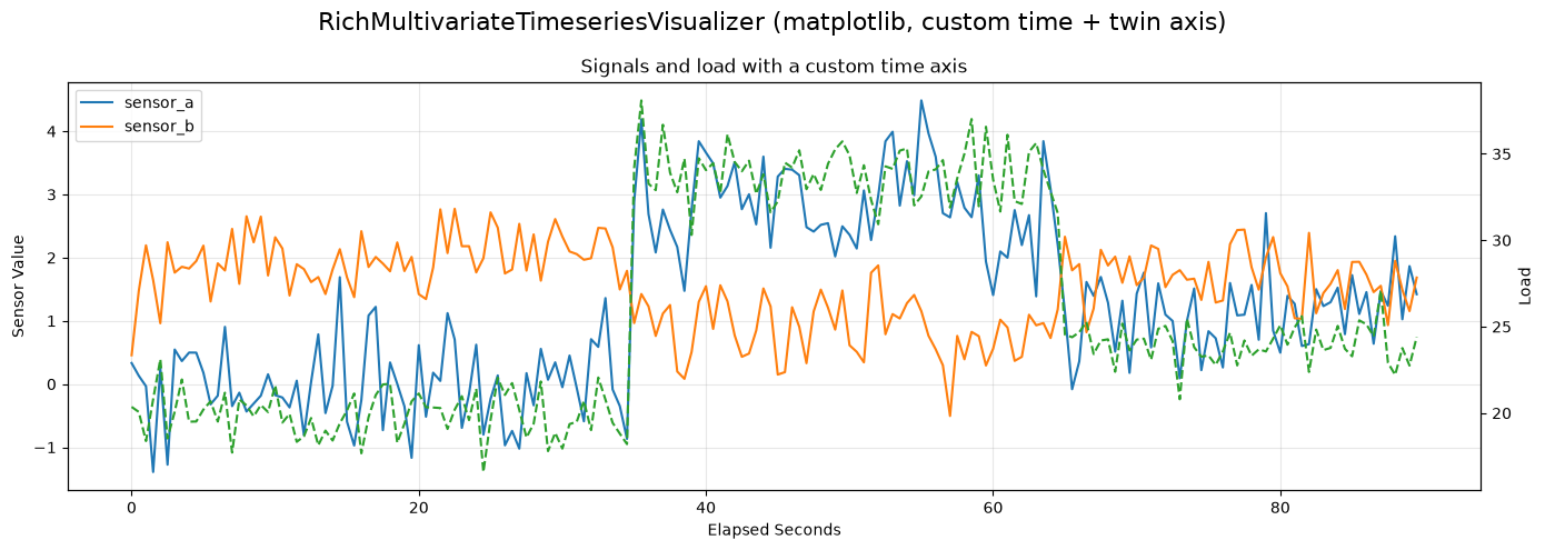
6.7 RichMultivariateTimeseriesVisualizer in plotly with a custom time column and twin axis
The plotly version uses the same rich API but draws into a subplot configured with secondary_y=True. This keeps the public visualizer API backend-agnostic while still making the secondary-axis behavior explicit in the figure setup.
rich_multivariate_visualizer_time_go = RichMultivariateTimeseriesVisualizer(DrawBackend.PLOTLY)
rich_multivariate_visualizer_time_go.set_data_provider(multivariate_pandas_provider_with_time)
rich_multivariate_visualizer_time_go.set_time_column("elapsed_seconds")
rich_multivariate_visualizer_time_go.define_plot(
    "operations",
    title="Signals and load with a custom time axis",
    xlabel="Elapsed Seconds",
    ylabel="Sensor Value",
    ylabel_twin="Load",
    grid=True,
)
rich_multivariate_visualizer_time_go.add_series("operations", "sensor_a", column="sensor_a", color="tab:blue")
rich_multivariate_visualizer_time_go.add_series("operations", "sensor_b", column="sensor_b", color="tab:orange")
rich_multivariate_visualizer_time_go.add_series(
    "operations",
    "load",
    column="load",
    twin=True,
    color="tab:green",
    linestyle="dash",
)

fig = make_subplots(
    rows=1,
    cols=1,
    specs=[[{"secondary_y": True}]],
    subplot_titles=("Signals and load with a custom time axis",),
)
rich_multivariate_visualizer_time_go.draw(
    figure=fig,
    axes={"operations": (1, 1)},
)
fig.update_layout(
    title="RichMultivariateTimeseriesVisualizer (plotly, custom time + twin axis)", height=450, showlegend=True
)
fig
Summary of Section 6: The multivariate visualization API now has two clear layers. PlainMultivariateTimeseriesVisualizer is best for simple one-dimension-per-panel inspection, while RichMultivariateTimeseriesVisualizer is designed for pandas-backed grouped plots, optional custom time columns, and twin-axis layouts.
Section 7. OnlineCpdPlotter
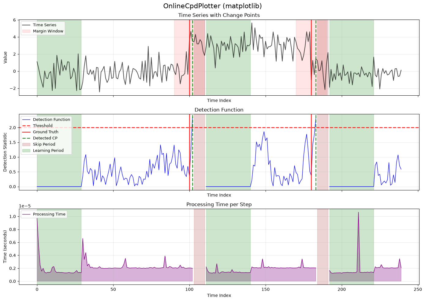
The next problem is figure coordination. Even direct visualizers still leave us responsible for wiring together the time-series panel, trace panels, and shared annotation components. OnlineCpdPlotter solves that coordination problem.
This is the highest-level plotting abstraction for online detection results in the current API. It owns default visualizers, default components, and a coordinated draw order, while still allowing explicit overrides when needed.
7.1 OnlineCpdPlotter in matplotlib
The plotter’s main motivation is convenience without losing structure. Instead of manually drawing the timeseries visualizer, the trace visualizer, and several components in the right order, we let one coordinator do it.
The matplotlib API is straightforward: construct the plotter with a backend, provider, and trace; set ground-truth information; provide an axes mapping; then call draw(...).
plotter = OnlineCpdPlotter(
    backend=DrawBackend.MATPLOTLIB,
    data_provider=visualization_provider,
    detection_trace=visualization_trace,
)
plotter.set_ground_truth(list(visualization_provider.change_points), margin=manual_margin)
plotter.set_legend_axis("detection_function")
fig, axes = plt.subplots(3, 1, figsize=(14, 10), sharex=True)
fig.suptitle("OnlineCpdPlotter (matplotlib)", fontsize=16)
fig = plotter.draw(
    figure=fig,
    axes={"timeseries": axes[0], "detection_function": axes[1], "processing_time": axes[2]},
)
for ax in axes:
    handles, labels = ax.get_legend_handles_labels()
    if labels:
        ax.legend(loc="upper left", fontsize=9)
plt.tight_layout()
plt.show()
7.2 OnlineCpdPlotter in plotly
The same coordination problem exists in plotly, and the plotter solves it in almost the same conceptual way. The difference is only that subplot targets are row-column coordinates instead of matplotlib axes objects.
Using both backends side by side makes the plotter abstraction especially clear: the provider, trace, and ground-truth information stay the same, while only the rendering target changes.
plotter_go = OnlineCpdPlotter(
    backend=DrawBackend.PLOTLY,
    data_provider=visualization_provider,
    detection_trace=visualization_trace,
)
plotter_go.set_ground_truth(list(visualization_provider.change_points), margin=manual_margin)
plotter_go.set_legend_axis("detection_function")
fig = make_subplots(
    rows=3,
    cols=1,
    shared_xaxes=True,
    vertical_spacing=0.08,
    subplot_titles=("Time Series with Change Points", "Detection Function", "Processing Time per Step"),
)
fig = plotter_go.draw(
    figure=fig,
    axes={"timeseries": (1, 1), "detection_function": (2, 1), "processing_time": (3, 1)},
)
fig.update_layout(title="OnlineCpdPlotter (plotly)", height=900, showlegend=True)
fig
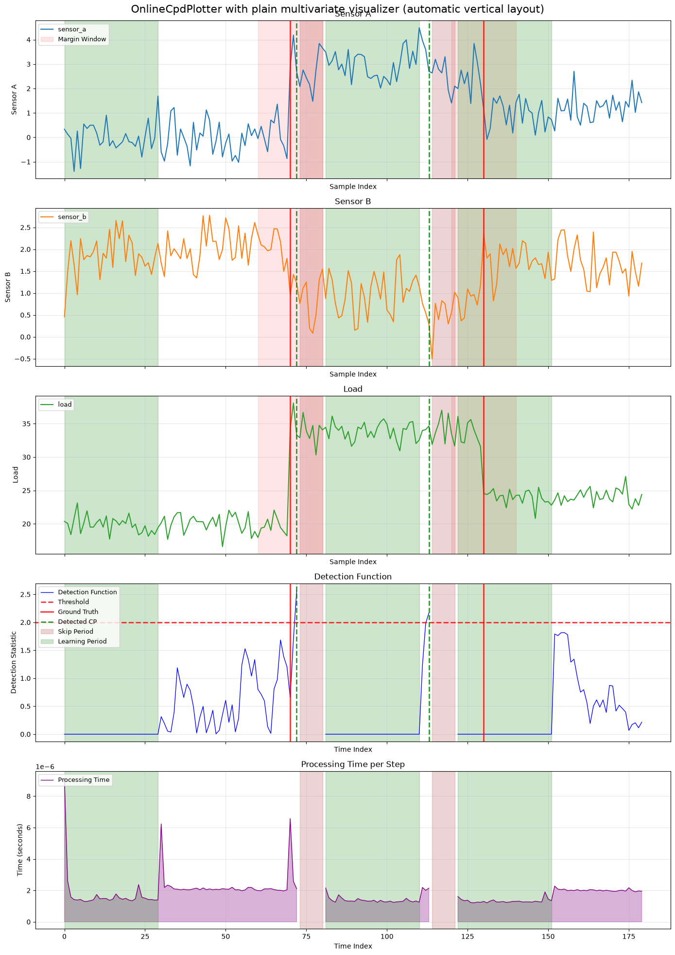
7.3 OnlineCpdPlotter with PlainMultivariateTimeseriesVisualizer and automatic vertical layout
The plotter can now coordinate a multivariate timeseries visualizer directly. In the plain multivariate case, the automatic vertical layout creates one row per timeseries axis and then appends the trace panels below them.
That makes the coordinator useful even when the data side is multivariate but the detection trace still comes from one selected signal or derived univariate view.
plain_plotter_visualizer = PlainMultivariateTimeseriesVisualizer(
    DrawBackend.MATPLOTLIB,
    dimensionality=3,
)
plain_plotter_visualizer.set_data_provider(multivariate_plain_provider)
plain_plotter_visualizer.set_plot_opts(axes=[0, 1, 2], xlabel="Sample Index", grid=True)
plain_plotter_visualizer.set_plot_opts(axes=[0], title="Sensor A", ylabel="Sensor A")
plain_plotter_visualizer.set_plot_opts(axes=[1], title="Sensor B", ylabel="Sensor B")
plain_plotter_visualizer.set_plot_opts(axes=[2], title="Load", ylabel="Load")
plain_plotter_visualizer.set_draw_opts(axes=[0], color="tab:blue", label="sensor_a")
plain_plotter_visualizer.set_draw_opts(axes=[1], color="tab:orange", label="sensor_b")
plain_plotter_visualizer.set_draw_opts(axes=[2], color="tab:green", label="load")

multivariate_plotter = OnlineCpdPlotter(
    backend=DrawBackend.MATPLOTLIB,
    data_provider=multivariate_plain_provider,
    detection_trace=multivariate_visualization_trace,
    layout="vertical",
)
multivariate_plotter.set_timeseries_visualizer(plain_plotter_visualizer)
multivariate_plotter.set_ground_truth(list(multivariate_plain_provider.change_points), margin=manual_margin)
multivariate_plotter.set_legend_axis("detection_function")
fig, ax_mapping = multivariate_plotter.default_layout()
fig.suptitle("OnlineCpdPlotter with plain multivariate visualizer (automatic vertical layout)", fontsize=16)
fig = multivariate_plotter.draw(figure=fig, axes=ax_mapping)
for ax in ax_mapping.values():
    handles, labels = ax.get_legend_handles_labels()
    if labels:
        ax.legend(loc="upper left", fontsize=9)
plt.tight_layout()
plt.show()
7.4 OnlineCpdPlotter with RichMultivariateTimeseriesVisualizer and automatic left-right layout
The automatic split layout now also works with the rich multivariate visualizer. The logical multivariate plots are placed in the left column, while the detection trace panels stay in the right column.
This is a useful default when the multivariate signal structure is the main story and the trace should stay visible beside it rather than below it.
rich_plotter_visualizer = RichMultivariateTimeseriesVisualizer(DrawBackend.PLOTLY)
rich_plotter_visualizer.set_data_provider(multivariate_pandas_provider_with_time)
rich_plotter_visualizer.set_time_column("elapsed_seconds")
rich_plotter_visualizer.define_plot(
    "signals",
    title="Signals",
    xlabel="Elapsed Seconds",
    ylabel="Sensor Value",
    grid=True,
)
rich_plotter_visualizer.define_plot(
    "operations",
    title="Operations",
    xlabel="Elapsed Seconds",
    ylabel="Sensor Value",
    ylabel_twin="Load",
    grid=True,
)
rich_plotter_visualizer.add_series("signals", "sensor_a", column="sensor_a", color="tab:blue")
rich_plotter_visualizer.add_series("signals", "sensor_b", column="sensor_b", color="tab:orange")
rich_plotter_visualizer.add_series("operations", "sensor_a", column="sensor_a", color="tab:blue")
rich_plotter_visualizer.add_series(
    "operations",
    "load",
    column="load",
    twin=True,
    color="tab:green",
    linestyle="dash",
)

rich_multivariate_plotter = OnlineCpdPlotter(
    backend=DrawBackend.PLOTLY,
    data_provider=multivariate_pandas_provider_with_time,
    detection_trace=multivariate_visualization_trace,
    layout="split",
)
rich_multivariate_plotter.set_timeseries_visualizer(rich_plotter_visualizer)
rich_multivariate_plotter.set_ground_truth(list(multivariate_pandas_provider.change_points), margin=manual_margin)
for component_name in (
    "ground_truth_lines",
    "margin_fill",
    "detected_lines",
    "forced_lines",
    "learning_fill",
    "skip_fill",
):
    rich_multivariate_plotter.remove_component(component_name)

elapsed_seconds = multivariate_pandas_provider_with_time.dataset()["elapsed_seconds"].tolist()
raw_change_points = list(multivariate_pandas_provider.change_points)
raw_detected_points = list(multivariate_visualization_trace.signal_change_points)
raw_learning_periods = list(multivariate_visualization_trace.learning_periods)
raw_skip_periods = list(multivariate_visualization_trace.skip_periods)


def to_elapsed_point(index: int) -> float:
    return float(elapsed_seconds[index])


def to_elapsed_region(start: int, stop: int) -> tuple[float, float]:
    return float(elapsed_seconds[start]), float(elapsed_seconds[stop])


elapsed_ground_truth_go = (
    VerticalLineVisualComponent(DrawBackend.PLOTLY)
    .set_lines([to_elapsed_point(cp) for cp in raw_change_points])
    .set_style(color="red", linestyle="dash", linewidth=2, alpha=0.8, label="Ground Truth", legend=True)
)
elapsed_detected_go = (
    VerticalLineVisualComponent(DrawBackend.PLOTLY)
    .set_lines([to_elapsed_point(cp) for cp in raw_detected_points])
    .set_style(color="green", linestyle="dash", linewidth=2, alpha=0.8, label="Detected CP", legend=True)
)
elapsed_margin_go = (
    VerticalFillComponent(DrawBackend.PLOTLY)
    .set_regions([to_elapsed_region(cp - manual_margin, cp + manual_margin) for cp in raw_change_points])
    .set_style(fill_color="red", fill_alpha=0.1, label="Margin Window", legend=True)
)
elapsed_learning_go = (
    VerticalFillComponent(DrawBackend.PLOTLY)
    .set_regions([to_elapsed_region(start, stop) for start, stop in raw_learning_periods])
    .set_style(fill_color="orange", fill_alpha=0.12, label="Learning Period", legend=True)
)
elapsed_skip_go = (
    VerticalFillComponent(DrawBackend.PLOTLY)
    .set_regions([to_elapsed_region(start, stop) for start, stop in raw_skip_periods])
    .set_style(fill_color="green", fill_alpha=0.10, label="Skip Period", legend=True)
)

index_ground_truth_go = (
    VerticalLineVisualComponent(DrawBackend.PLOTLY)
    .set_lines(raw_change_points)
    .set_style(color="red", linestyle="dash", linewidth=2, alpha=0.8, label="Ground Truth", legend=True)
)
index_detected_go = (
    VerticalLineVisualComponent(DrawBackend.PLOTLY)
    .set_lines(raw_detected_points)
    .set_style(color="green", linestyle="dash", linewidth=2, alpha=0.8, label="Detected CP", legend=True)
)
index_learning_go = (
    VerticalFillComponent(DrawBackend.PLOTLY)
    .set_regions(raw_learning_periods)
    .set_style(fill_color="orange", fill_alpha=0.12, label="Learning Period", legend=True)
)
index_skip_go = (
    VerticalFillComponent(DrawBackend.PLOTLY)
    .set_regions(raw_skip_periods)
    .set_style(fill_color="green", fill_alpha=0.10, label="Skip Period", legend=True)
)

fig, ax_mapping = rich_multivariate_plotter.default_layout()
fig = rich_multivariate_plotter.draw(figure=fig, axes=ax_mapping)
rich_timeseries_axes = rich_plotter_visualizer.ordered_axes
trace_axes = ["detection_function", "processing_time"]
trace_axes.extend(sorted(rich_multivariate_plotter.trace_visualizer.state_visualizer.axes))
trace_axes = [axis_name for axis_name in trace_axes if axis_name in ax_mapping]

for component in (
    elapsed_ground_truth_go,
    elapsed_detected_go,
    elapsed_margin_go,
    elapsed_learning_go,
    elapsed_skip_go,
):
    for index, axis_name in enumerate(rich_timeseries_axes):
        component.draw(fig, ax_mapping[axis_name], add_legend=index == 0 and component is not elapsed_detected_go)

index_ground_truth_go.draw(fig, ax_mapping["detection_function"], add_legend=False)
index_detected_go.draw(fig, ax_mapping["detection_function"], add_legend=True)
for component in (index_learning_go, index_skip_go):
    for axis_name in trace_axes:
        component.draw(fig, ax_mapping[axis_name], add_legend=axis_name == "processing_time")
fig.update_layout(
    title="OnlineCpdPlotter with rich multivariate visualizer (automatic left-right layout)",
    height=1100,
    showlegend=True,
)
fig
Summary of Section 7: OnlineCpdPlotter is the coordinator layer of the online visualization API. It bundles sensible defaults and consistent draw ordering so repeated diagnostic plots become easier to produce and less error-prone.
Section 8. Single-Run and Multiple-Run Metrics
Visualization often sits next to metric computation. A figure answers “what happened here?”, while a metric answers “how should this run, or collection of runs, be summarized?” This section gives the minimal metric context needed to connect visual traces to the benchmarking notebooks that follow.
The important distinction is scope. A single-run metric evaluates one SingleRun: one trace paired with one labeled provider. A multiple-run metric evaluates a sequence of those runs and aggregates or derives a result across the collection. The reset and no-reset benchmarking notebooks build on this same split, but add orchestration, registries, and scenario-specific tables.
metric_run = SingleRun(trace=visualization_trace, provider=visualization_provider)
metric_margin = (0, 12)

single_run_metric_values = {
    "true_positives": TruePositiveCount(error_margin=metric_margin).evaluate(metric_run),
    "false_positives": FalsePositiveCount(error_margin=metric_margin).evaluate(metric_run),
    "false_negatives": FalseNegativeCount(error_margin=metric_margin).evaluate(metric_run),
    "delays": Delays(max_delay=metric_margin[1]).evaluate(metric_run),
    "run_lengths": RunLengths().evaluate(metric_run),
}
print(single_run_metric_values)

metric_runs = [metric_run]
multiple_run_metric_values = {
    "classification_report": ClassificationReport(error_margin=metric_margin).evaluate(metric_runs),
    "mean_delay": MeanDelayMetric(max_delay=metric_margin[1]).evaluate(metric_runs),
    "median_delay": MedianDelayMetric(max_delay=metric_margin[1]).evaluate(metric_runs),
    "arl": ARLMetric().evaluate(metric_runs),
}
display(pd.DataFrame([multiple_run_metric_values]).T.rename(columns={0: "value"}))
{'true_positives': 2, 'false_positives': 0, 'false_negatives': 0, 'delays': [2, 3], 'run_lengths': [102, 81]}
| value | |
|---|---|
| classification_report | {'tp': 2, 'fp': 0, 'fn': 0, 'precision': 1.0, ... |
| mean_delay | 2.5 |
| median_delay | 2.5 |
| arl | 91.5 |
8.1 Single-run metrics
The code above uses the same trace and provider that the plotting examples used. That is the key idea: a SingleRun is just the pairing of those two objects. Classification primitives compare detected change points with provider ground truth under an error margin, while online metrics such as Delays and RunLengths inspect event timing.
These values are useful for debugging one figure. If the plot looks surprising, the single-run metrics give a compact numerical summary of the same run.
8.2 Multiple-run metrics
Multiple-run metrics accept a sequence of SingleRun objects. In this notebook we pass one run only so the API shape stays visible without reintroducing a full benchmark campaign. In real evaluation, the sequence usually comes from a benchmark registry over many providers or detector configurations.
ClassificationReport is a derived metric: it combines TP, FP, FN, precision, recall, and F1 into one dictionary. MeanDelayMetric, MedianDelayMetric, and ARLMetric are aggregation metrics: they evaluate a single-run timing metric on each run and summarize the collection.
Summary of Section 8: Metrics and visualizations are two views of the same execution record. A trace can be drawn for interpretation, wrapped into a SingleRun for local metrics, or collected with other runs for benchmark-level summaries.
Section 9. Final Recap
This chapter built the visualization story around one provider and one online trace. We started with manual matplotlib and plotly figures, moved reusable annotations into visual components, used direct visualizers for semantic panels, added both plain and rich multivariate visualizers, coordinated full figures through OnlineCpdPlotter, and finally connected the same trace to single-run and multiple-run metric APIs.
The next notebooks use these ideas in benchmark settings. Reset benchmarking turns configured detectors into whole-run event-sequence metrics, while no-reset benchmarking keeps continuous traces and interprets them under threshold and policy choices.